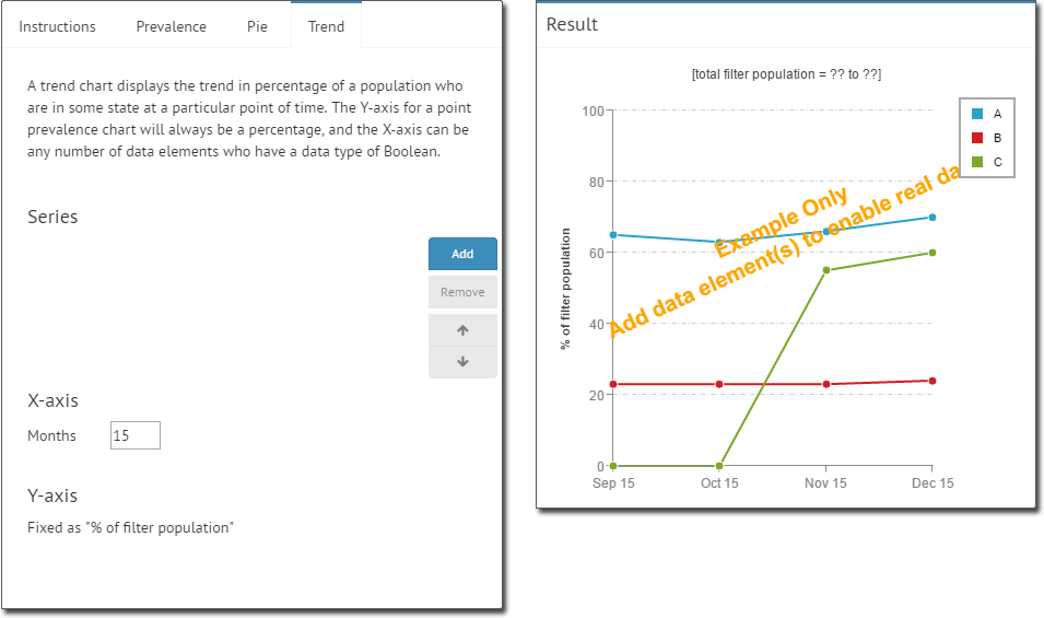
Choose a Visualisation - Trend
Before you begin
Because the Trend chart displays changes in data over time (on a month-to-month basis), you must have at least two collections to compare.
The data represented by the trend point for each month in the graph is sourced from the last collection taken for that month.
Procedure
-
Select the Trend tab. Initially this tab will contain no data, as shown in our example below.
-
Click Add to add a data element to examine. You will be
prompted to select an element.
- Select an element. In our example, we selected Ethnicity recorded.
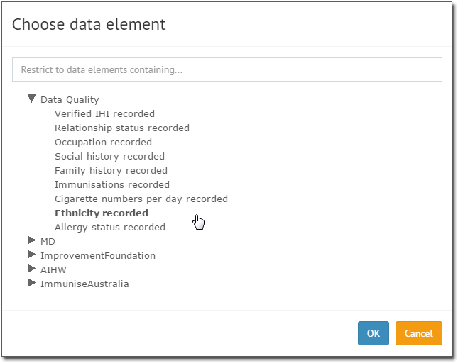
- Select an element. In our example, we selected Ethnicity recorded.
-
Click OK. You are returned to the Visualisation Builder,
where the Result section now displays your data.
- You can add more data elements as desired. In our example, we've added 'Immunisations recorded'.
- You can remove a data element by selecting it, and clicking Remove.
- Change the order in which elements are displayed by selecting one and clicking
 or
or 
- Alter the X-axis time period by changing the value in the Months field.
-

- Ensure you click Save Changes to save the Widget before you close the Dashboard you are working on.